Projects

Showing posts with label Propaganda Posters. Show all posts

Friday, 9 November 2012

AF102 | Evaluation

Now I've come to the end of my first Uni project. Overall I'm really happy with the way I've worked throughout this project, and the designs I have managed to produced back this up well. 


I am glad I've managed to produce posters in both the British and Soviet propaganda style of the early 1900's, as this was one of the aims I'd set myself at the beginning of the project. 

I think the right hand poster is more successful than the left hand one, simply because I spent more time finessing it and went through many more versions thus developing it more than with the second poster. I don't feel I've had the time to complete what I intended to, and so features of the original such as the rising sun graphic within the star are not included unfortunately. This is a definite improvement to make in the next project; time management.

None the less I'm very happy with the left poster and how its come out. My favourite feature of it is the way i've drawn the highlights/lowlights on the clothes. I've used the locations for the clothing highlights from the original poster, but I've used sharper lines everywhere. I think this adds a feeling of the constructivism art style, without taking over the whole poster and without loosing the style of the original poster. 

With the right hand poster being my favourite there is inevitably going to be far more to comment about. I really think I've nailed what we were asked to do in this project with this poster, which was "Produce at least one poster promoting an aspect of Web 2.0 Social Media..." which must be "Based on propaganda posters from the first half of the twentieth century - 1900 to 1950." I've used a more modern, albeit minimalistic way of producing the art for the poster, whilst replicating the original visual style through the font, colour and layout. 

I'm happy with the font choices I made, and although I was advised by my class to change the top font. I think the bottom font, and its layout is perfectly finessed to replicate the posters original. I think the kerning on the bottom text adds a slight modern element which I really like, but the way it is positioned, along with its size is still original.

I feel the subtle features of my poster have been the most important; the finer details are by far my favourites. I think the element I'm most proud of is the background. The Vimeo logo is the biggest thing on the poster, but it doesn't take over from the woman, or any of the other features uncontrollably. The way I've made the colouring pastel make it seem that bit more subtle, and in even if you don't consciously think about it you know its there and the underlying brand behind the poster is unmissable. Again the small Vimeo logo's featured all over the poster continue this subtle brand placement that I really like.

The colouring of this poster was based upon shades of brown, blue and cream; All of which were taken from the orignal poster, apart from the blue which was selected from the Vimeo logo, and then by reducing the blue I managed to make it less intense. I think I've done a great job of introducing a foreign colour into the colour palette without reducing the authenticity of the overall design. I think the blue adds the modern feel the brief required, and relates to Vimeo so strongly it can't be misinterpreted. 

I'm happy with how this whole project has turned out. I found that to start off  I was quite daunted by the brief and the what was expected by the due date. With this in mind I started by research straight away I couldn't select a specific art style I really wanted to do, which caused me to become quite distracted and go off course from what the brief had specified. I eventually ended up with both British and Soviet propaganda as my favourite art styles and I started the British one. I thought this poster developed really well, with 4 versions created and developed upon until finally deciding on my last design.

I have had some great feedback from my class mates about what was working, and what wasn't. At  first I was nervous about presenting my work, but after having a long group discussion about any changed that needed to take place all these feeling were replaced with confidence about my design and some elements I needed to work on in both my posters. 

I feel I can take forward a lot of skills into the next project, in terms of software techniques and pre production. I think my most valued skill with be that of confidence to draw and come up with ideas. One of the worst problems I've come up against whilst designing before is the lack of confidence to try new techniques, or to even start drawing with a pencil because a fear of failing, but this project has definitely turned things on their head. The one point I will pay more attention to in the next project is reading the brief. Although I thought I knew what was required of me throughout, on review of the brief at the end I realised I could have been far more efficient had a read the brief more often. 

I think i've gained great experience from this project, and am a lot more confident with Illustrator now than I was before. Next time I aim to leave myself more time to produce my work at the end, and to read the brief more often. 

Second Poster | Finalised


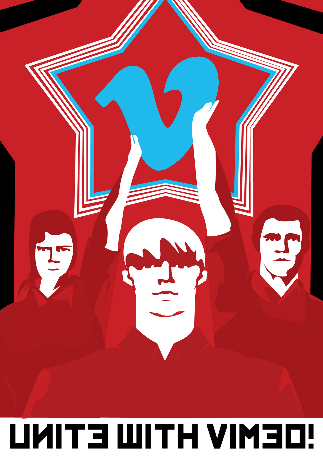
I've finally finished my second poster. I've added a background star as is featured in the original and I think this really finishes the poster off. It adds an extra element of depth where it was previously very flat. I'm really happy with the outcome, and i feel I have completely replicated the art style whilst adding a modern essence to it. 

Second Poster | Details


I have added highlights/ lowlights to the clothes. I've also added in the star outlines on the edge of the poster as I think this is a key characteristic from the original piece of art. 
I'm really happy with the poster now, and as I will be handing all my work in at the end of today I won't be changing an awful lot. 

I think I have suceeded in mimiking the art style of the original poster in terms of the people. The Star behind that however is a more modern take on the original. I think the clean, crisp lines bring it right up to date, along with the Vimeo logo centred in the middle and the negative space surrounding. I don't know whether to experiment with the rising sun effect behind the Vimeo logo or not, as this was another key characteristic of a lot of the soviet posters. 

Monday, 5 November 2012

Hand text | Removal


Here is a screenshot of my edited poster. I have removed the text from her hands, enlarged and aligned "Compression" to the centre. These changes were all suggested by my class mates during a critique of my work. Although I had a lot of changes suggested by them, I decided just to go with these because I feel happy that the rest of my design doesn't need changing. 

Overall I'm really happy with this poster, although no doubt I'll have a couple more changes to make before handing it in. Probably my favourite feature of it is the suble Vimeo logo's throughout. They make the viewer subconsciously think about the brand, without having it as the focal point of my design. 

Critique | Corrections

Today I displayed my work to my classmates in order to get some feedback on what they think of my design.
They gave me a lot of points to work upon for both of my posters, especially the first one. 
To do list:

  • Larger bottom font/ different font

  • Add softer texture to background V
  • Move text from hands, make boxes into Jack in the box with text coming out of them
  • Less bend on line underneath compression and centre "compression" in order to balance out loss of hand text.

  • Rethink the colour of the dress highlights. No light source in my poster so the highlights are too bright. Possibly use slightly lighter brown than the dress colour to illustrate highlights.


For my second poster I have had problems selecting a colour palette. I want to include colours that reference Vimeo, but to do that I need blue, which completely fights against all the original colours of the poster because it is a cool colour. After discussing I've decided to:


  •  Experiment with either Black/White/Red or continue with the Blue/White/Red colour schemes.
  • Add far more detail on the clothing and faces
  • Use the star shape at the edge of the poster to emulate the original


Friday, 2 November 2012

Second Poster | Progression

I decided to start my second poster today and below is a screen shot of my progression so far. I've had to alter the colour scheme slightly, removing the yellow and replacing it for the Vimeo Blue. I feel by changing this element I've lost a lot of the Russian character the poster originally had, but without it I can't see it working.

The next tasks for me are to continue doing the finer details of the poster, and experiment with the colour palette.


Thursday, 1 November 2012

Plans | Second Poster


As i've successfully completed one poster I would like to try to complete a second before our hand in date.

Because I've already researched fairly deeply into the Constructivist art movement and I am very fond of this art style I am going to use a soviet poster as inspiration for a second poster design. I'm going to continue promoting Vimeo, but using a different aspect.


My ideas for this poster so far:

  • "Unite with Vimeo!"
  • Aspect - Groups
  • Vimeo logo in centre of the star

Wednesday, 24 October 2012

Poster | Finalised


I have finally completed my 1st poster, inspired by the "Come Into The Factories" poster, illustrated by Phillip Zec in 1941. Below you can compare my updated version of this poster, and the orignal.


Im pretty chuffed with this, and after using the live trace tool in Illustrator CS4 to create this textured effect over the top of my poster I think I've succeeded in creating a poster to match what the brief asked of me. 
Here is the colour palette I ended up selecting. It includes many shades from the original poster, along with the blue selected from the Vimeo logo. I've also included screen shots of the hexadecimal colour codes for each of them. 

Final | Background | Textures


Here are two copies of my nearly finished poster. The one on the left shows the background i've added in. I thought I could do with adding a Vimeo logo in the background because there was a lot of empty space. I also thought there needed to be a larger logo in there somewhere to emphasise who I was promoting.


 I decided to add a rough gradient to the bottom of the "V" because I had seen this used in a lot of propaganda from that era. To do this I used the pen and blend tools. I began by drawing a rough shape and then copied this and set the opacity to 5% on the second one. I then completed the blend with the blend tool using 8 steps on the blend option.

To finish the poster off I found a bitmap texture online that I thought would suite my poster really well. As I was well aware I couldn't use bitmaps images in my poster I used the Live Trace tool to make it into a vector image. I then lowered the opacity to 14% so that it blended seamlessly with the rest of the poster, whilst retaining some of the texture over the top. Below you can see the subtle textures I've added:


Tuesday, 23 October 2012

Illustration | Developed

Here is an almost finished version of the woman ready to use in my propaganda poster. She now has all facial features, clothing highlights and added details such as dress folds and Vimeo logo belt. 


One of the elements I was suggested to improve in my poster was the company logo promotion. Although in my original mock up I had 4 Vimeo logos, they simply weren't effective enough or central to the design. With this in mind I drew out a belt buckle in the Vimeo logo shape and added it to the clothing on the woman. Its very subtle but effective, and now more central to my design. 

Illustrating | Woman

Today I've almost finished drawing the iconic woman to go in my poster. I've used the pen tool very extensively now and I'm quite happy with how this had come out. I

To develop this drawing further to show inspiration from the original I'm going to add highlights all around her clothing as can be seen on the original. 

Tuesday, 16 October 2012

Pitching | Concept

Yesterday I had to present my concept for this project to my class. I went with a simple, clean theme for my presentation. Minimal texts, and pictures to support anything I wanted to discuss during the presentation. 

I felt that my pitch went fairly well, and constructive comments were made about how to improve and develop the ideas I've come up with so far. The elements of my design we discussed were mainly my slogan and aspect change, because it has made my overall poster a lot weaker than the one I'd originally come up with. We discussed how I've got two great ideas, but how they're both stepping too far past the mark so somewhere in the middle of them would be perfect, possibly a mixture between the design on the newest poster and the aspect of the first one? We also talked about how there needed to be more Vimeo logo's in it somewhere, and a 5th storage box added somewhere in my design to go along with the 5GB/Week aspect of Vimeo PRO, although this will become obsolete if I go back to my "Compression - Less Is More" tag line. 

By the end of the discussion I had this list of elements to work upon:
  • Vimeo Buildings
  • More Logo's
  • Keep Compression Slogan
  • Develop Original Idea

Friday, 12 October 2012

Problems | Redesign

Although I was pretty sure I'd selected a successful aspect and design to continue developing I came toa fault in my design. I hadn't used enough of the original poster design for my design to be legitimate enough for use in this project, so with this I had to add to the design as seen in the screenshot below:


I began by using the colour scheme from the original poster, and then progressively adding more artwork. I think the woman is a key feature and must be used in my poster so that it is clear where I've referenced my design from. I ended up being unhappy with the results and so I continued to develop it. 
Here is the newest design I've come up with, only slight changed have been made but I think overall it is a far more effective poster, and most of all it reflects the artwork of the original. Although it is unfinished it has made me realise what I could achieve with more work. I've changed the aspect I'm promoting too, it is now focused VIMEO PRO which allows you to have more storage space and more uploads per week.  
 

Tuesday, 9 October 2012

Inspirational | Posters

After looking at constructivist artwork a lot, i've come to the conclusion that I'm not going to use it after all. I've become a lot more interested in British and American Propaganda after re-reading my first post and so I've reverted back to that as my focus, although I still want to take some of the ideas from constructivism and use them in my design. 

Here are examples of typography I've taken from both British and American propaganda posters. I really like the use of a hand written font and a san-serif font in the same poster as I feel it is a strong part of the visual language seen on the posters. I feel it is one of the most important visual characteristics to mimic in my poster. 


When looking into the colour scheme for my work I decided I'd use the colour palette from the original. Colour is a huge part of the visual language, arguably the most important visual language a designer must conquer in a design. I figured I'd use the original colour scheme as well as an extra colour to support the social media I want to promote which is in this case pastel blue for Vimeo. Below is a pixelated version of the poster so you can quickly see the colours I am going to use. 


Aspect Choices | Mock Ups

After much deliberation I've chosen to promote Vimeo's HD service, as in my experience when compared to others it is far superior in terms of quality and the way it runs. I presume this is down to the way the video is compressed once it is uploaded to Vimeo, and so my first poster design revolves around this.

Here are two mock ups I did in a couple of hours today. I used a British World War 2 Propaganda poster by Phillip Zec for inspiration, mimicking the colours and some of the layout. The top design was an original mock up, but I felt it needed more development so I added some VHS tapes into it to symbolise the videos on Vimeo. I think that the fonts need a lot of work, but you get the gist of the art style i'd like to use.


Monday, 8 October 2012

Decision Time | Which Site?

I've come to the conclusion I'd like to promote Vimeo. It is a social media website based around video, much like YouTube. I decided I'd like to promote this over all the other clients because I haven't used it as extensively as the others, so I have a fresh view on it and I'm keen to learn about it. No preconceptions. Hopefully by the time I write my next post I will have come to a decision about the specific aspect I'd like to promote. 


Social Media | Promoting Aspects

We have been asked to promote a certain aspect of a social media website. Below I have researched and recorded the different aspects for each of the social media websites I would like to promote


  • HD
  • News Feed
  • "Like"
  • Watch Later
  • Staff Picks
  • Comment
  • Upload
  • Create Albums/ Groups


  • Poke
  • Like
  • Comment
  • Inbox
  • Chat
  • Share

  • Like/Dislike
  • Comment
  • Upload
  • Subscribe
  • HD
  • Widescreen


  • Tweet
  • Direct messenger
  • Follow
  • Integrated applications 

Now i've completed this list I can begin to gather together a short list of clients and aspects i'd like to promote. 

Monday, 1 October 2012

Art Movement | 20th Century


Source: https://lh5.googleusercontent.com/-zE8ib3Ot_YM/TX
axn8wH8sI/AAAAAAAAAys/NYQ5YJCUS6Y/s1600/shepardfaireyxsaks1.jpg
  

I've finally found an art movement that I really like from the 20th century, called Constructivism. It focuses mainly on shape and the hard straight lines created by these. Constructivism has been developed from another art form called Futurism, which originated from Russian in the early 1900's and is still inspiring people to make artwork today. Below are some examples of the modern constructivism work produced by artists such as Shepard Fairey, and album art for Franz Ferdinand which was based on the work of a 1900 constructivism artist; El Lissitzky.
   

Source:http://25.media.tumblr.com/tumblr_lvi9qnhv
5o1r7wmdzo1_1280.gif  


Source: http://4.bp.blogspot.com/_dTPtJCThggI/SQkIYEUomnI/AAAAAAAAAIY/7
EtfOYEb-9U/s400/600px-Franz_Ferdinand_-_This_Fffire.jpg

Source: http://obeygiant.com/images/2010/11/Constuctivist-banner-
red-cream-500x664.jpg

In summary I think this art movement has potential to be the style I am going to be mainly inspired by in my final poster, I feel they show a great alternate and unique style compared to the rest of the propaganda posters of the era. It has my favoured aspects in art, abstract and minimalism.

The mainly British propaganda reviewed earlier in my blog are very contrasting; softer colours, smoother lines and some portraiture art. The constructivist art style is far more in your face with it bright hard hitting colours, strong clean cut lines with all manor of angles used to create ever stronger  impacting shapes. After researching into the background of this era of art you can quickly link the art style and the stereotypical Russian image of strength together, everything about constructivism is strong and unforgiving. The captions are powerful and encourage strength into the communist culture.  

In terms of using constructivism for this project I think my poster would have to feature a very hard hitting caption something like "Vimeo HD Came First! Join the revolt!". Maybe something even shorter and harder hitting would be more suited though..."Join the revolt!"would be ample with the rest of the caption could be told through visual language.

Tuesday, 25 September 2012

Research | Modern Propaganda

Source: http://miukoridi.com/wp-content/uploads/2011/08/shepard-fairey-3.jpg, http://miukoridi.com/wp-content/uploads/2011/08/shepard-fairey-3.jpg

As I've been discussing 1900-1950s propaganda in the last part of research I figured I'd start some research on the modern propaganda artist'. Shepard Fairey is far better known for his 'OBEY' branding that has spread like wild fire over America and the UK, but he does fantastic modern propaganda posters. The one above sports the phrase "Drop sneakers not bombs". This phrase has been adapted to be attractive to many different target audiences, for instance the image below would be aimed at car enthusiasts:


Source: https://dubkorps.com/files/imagecache/gear_list_large/WHT_DropCarsNotBombs_big.png

These are opposing to the attitude of all of the posters I have previously reviewed, but the art work that Shepard produces is very much in the same style as the artist i previously reviewed, Henry Koerner.

 Source: http://www.marksandmeaning.com/wp-content/uploads/2009/03/shepard_fairey_obama-poster.jpg

" Fairey sold 350 of the posters on the street immediately after printing them." 
Source: http://en.wikipedia.org/wiki/Barack_Obama_%22Hope%22_poster.
This poster of Barack Obama was created by Shepard in 2008 for the American Presidential Election. I find it fascinating how a street artist has come to be so heavily impacting on the election, with over 300 of these posters sold on the streets by Shepard himself. Along with his success with the election poster, his clothing brand "OBEY" has become huge in The United Kingdom over the last year or so, going from something of a indie clothing brand to a fashion phenomenon for teenagers.

Source: http://madamepickwickartblog.com/wp-content/uploads/2009/09/shepard-1.jpg


Shepard uses minimum amounts of gradients in his work. This is where his work contrasts to Henry's, but the use of American flag colours is a very strong link creates a strong link between both of their styles. The use of these colours conveys the image that America is self driven, and is patriotic.


Source: http://graphics8.nytimes.com/images/2009/01/09/timestopics/shepardfairey_395.jpg

"Frank Shepard Fairey (born February 15, 1970) is an American contemporary graphic designer and illustrator who emerged from the skateboarding[1] scene. He first became known for his "Andre the Giant Has a Posse" (…OBEY…) sticker campaign, in which he appropriated images from the comedic supermarket tabloid Weekly World News. His work became more widely known in the 2008 U.S. presidential election, specifically his Barack Obama "Hope" poster. The Institute of Contemporary Art, Boston calls him one of today's best known and most influential street artists.[2] His work is included in the collections at The Smithsonian, the Los Angeles County Museum of Art, the Museum of Modern Art in New York, the Museum of Contemporary Art San Diego, the National Portrait Gallery in Washington, the Virginia Museum of Fine Arts in Richmond, and the Victoria and Albert Museum in London.[3][4]" 
Source: http://en.wikipedia.org/wiki/Shepard_Fairey

I really like Shepard's work overall, he uses a contemporary posterised style I haven't seen in any other propaganda to show highlights and low lights on peoples faces. To keep things simple he uses a very small colour palette of 4 colours or less.

The Brief | Propaganda

This is my first year of doing Digital Media Design, at foundation degree level. The first brief requires me to design at least one modern day propaganda poster for a social networking website, in the style of a 1900- 1950s poster. We have the choice of designing for:
  • Facebook
  • Twitter
  • Flickr
  • Google+
  • LinkedIn
  • Blogger
  • Vimeo
  • YouTube
Although I have been given the list above, I can also suggest and discuss designing for another service with my lecturers.