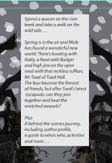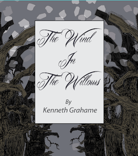

I have started making more changed to my book cover since the critique. I've changed the background colour to be darker as this makes the scene on the cover seem a lot more sinister. I've also added the extra text that was missing previously from the front cover, spine and I've moved the blurb to sit onto of the trees instead of underneath. I am undecided as to whether I will keep the front underneath the trees or on top. I will discuss further with my classmates in order to make a decision. I've thickened up the tree lines so that it seems more like the Wild Wood its meant to be, not just a line of trees. Here's some screen shots to illustrate |
Still to do:
- Evil eyes in the woods
- Roots
- More snow falling
- Move bottom left text elsewhere


No comments:
Post a Comment